COLLABORATION
Messaging
Upon receiving feedback from the professor to clarify the need further and focus on the specific benefits provided by the tour, there was a drastic change in the brand's core messaging. Applying the feedback and refocusing on one need allowed the brand messaging to form. It highlighted the genuine need of the brand, the benefits offered, and, most importantly, the psychographics that shape the brand's target audience. As stated by Busuttil (2013), focus or refocus, for that matter, answered the "So What?" of the brand.
Original Core Message
A concert tour for Mandy Madison, a classically trained jazz pianist, now leading a hip-hop group.
The tour will provide a sense of understanding and stimulation to socially aware and socially active men and women of the millennial generation. The tour will include stops in major US cities and sets in various music festivals throughout the summer.
Revised Core Message
A concert tour for Mandy Madison, once a world-renowned jazz pianist, now leading a hip-hop group, performing, and educating the audience on the last 50 years of hip-hop and Jazz and the way the two genres not only influenced her but music itself on a global scale.
What benefit is being promised?
Understanding: the need to comprehend, teach and learn, discover patterns, and make connections (Felton’s Definition)
Her tour will provide an understanding of two American music genres on a deep, intimate level to music lovers who grew up with hip-hop but also have the urge to understand and make connections to the music and the pioneers that helped shape the genre (not limited too) Jazz, funk, r/b, and soul artists before and during the 1970s.
Brand Name & Theme
Initially, the tour name was intended to be Rhythmically Akin. The professor was concerned and offered the following feedback: There needed to be more clarity as the name could be misunderstood simply due to the context and true meaning of the word akin to the larger context of the brand itself.
The tour is meant to highlight hip-hop and jazz's impact on each other (amongst other genres of music that impacted hip-hop). This is why, ultimately, through further discussion, the design decision was to utilize a fabricated word, “Rythmakin.” This revision worked for multiple reasons: the words were affixed or close to each other. More importantly, the two genres are rhythmically akin or kin: of similar nature, character, or related. Furthermore, it resonates with hip-hop music as it is primarily created by DJs creating rhythm or “rhythm making.”
Based on the professor's feedback, another revision to the brand was the theme. Initially, the word enrich was decided upon to portray the theme, as that is a literal theme, not a visual theme; it needed to be altered. Upon further revision, the theme was revised to Into the Mystic. It spoke to music's spiritual or mystical power and the journey the consumers will take with Mandy Madison. It utilized language that could be communicated visually.

Is/Isn't
Two other pieces of feedback that originated in discussing the previous week’s work were on the is/isn’t section due to the specific word choices and their implied meanings.
The significant issue here is that the word reborn did not correctly reflect the purpose of this statement. Mandy Madison is not reviving something dead, which utilizing the word reborn would suggest. She is not reviving anything as the music she is helping to shape and evolve is still living, as dormant as it may seem to the average consumer. This vital design decision based on feedback is echoed throughout the rest of the brand development, from creating organic textures and vibrant colors to the solution using a strong and bold archetype such as explorer.
Mandy Madison: Rhythmically Akin is living
Mandy Madison: Rhythmically Akin isn’t reborn
Mandy Madison: Rhythmakin' is living
Mandy Madison: Rhythmakin' isn’t revived
Inspirational was intended to speak to something that might not have been as substantial as transformative, as someone can be inspired but may not act, or it simply cannot have a lasting impact on an individual. The statement's purpose is to speak to the lasting impact that music can have on a human being; as stated in the Research PLO, hip-hop music has found its way into the medical community to treat patients (Mashable, 2023). This is why fleeting was chosen to represent the statement's purpose better and, in turn, the brand. This ultimately led to the final revision from that week, altering the primary tagline from Enriching Mind and Soul to Evolving Mind and Enriching Soul. However, the words and meanings can be similar and interchangeable beyond simply creating an alliteration. It was essential to indicate the evolution or growth of the mind regarding understanding and acquired wisdom or knowledge.
Mandy Madison: Rhythmically Akin is transformative Mandy Madison: Rhythmically Akin isn’t inspirational
Mandy Madison: Rhythmakin' is transformative
Mandy Madison: Rhythmakin' isn’t fleeting
Look & Feel
"Kill the Darlings"
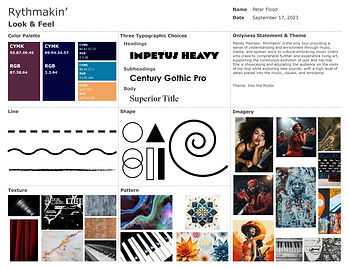
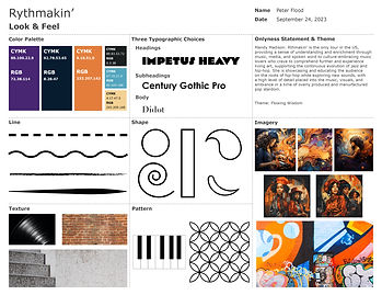
The feedback from the professor on the original look and feel board was that it needed more consistency. There needed to be more cohesion due to too many stylistic differences across the document. This was an excellent critique of the original draft, ultimately leading to a far more cohesive look and feel within its third iteration due to a great deal of culling and refinement in style. The imagery, including texture and pattern, went through the most iterations. It is visible that the texture section was overrun with conflicting images, some of which would barely qualify as textures versus images; the same thing can be said of the pattern section. Ultimately, these choices would be narrowed even further as the brand continued progressing, and they would help form a visual system to convey the brand message. As Adams (2015) stated, consistency allows a brand to be quickly recognized and effectively communicated.
Logo Ideation
The overarching concern from the professor, looking through the initial sketches, was that if the tour name were to be split into two lines, would it be a challenge for the viewer to understand? That was a very authentic concern that was present while creating the original set of logos. As that was the case in roughly half of the original sketches, it proved to be a helpful confirmation that it was creating confusion in a critical part of the brand identity, the brand logo, which, for most consumers, is the first brand touchpoint they might encounter. Ultimately, it helped to whittle down the logos to pursue in the refinement process.
Through self-evaluation of the initial 33 logo choices, many discoveries and refinements were considered. A great deal of concern was in the legibility of the designs as well as their connection with the brand. There were many attempts to include iconic instruments and urban features to tie into the birthplace of hip-hop, as well as musical notes and other sheet music features. By exploring these options, aspects of abandoned sketches made their way into the final logo, while others, in particular, the use of piano keys or microphones, felt too cliché. One aspect that is somewhat distorted but certainly very intentional on the final logo that was explored significantly in the original weeks of ideation is a spiral. Beyond that, the more prominent or present icons carried through were the bass clef and vinyl record.


Upon further examination of the six chosen logos to move forward with, there were many revelations and insights to propel forward within the approach to the final logo design. The chosen logos went from one extreme to another regarding convergent and divergent thinking. However, the final logo is complicated to imagine when looking at the grouping of sketches; the self-evaluation and forthcoming revisions are the reasons for its existence. Ultimately, this logo began the process but borrowed from the following two logos in its final design.
The first self-evaluation of vectorized logos clarified the rest of the design process. Genuinely seeing a shape in a crisp form versus a more half-hazard approach that is visible in traditional sketching made issues abundantly clear. It brought the more technical aspects of the designs into focus, such as the kerning and leading of the various words, the proximity to one another, and any shapes included in the overall designs. It validated what logo options should continue to be pursued and, very importantly, what options had to be discarded and no longer pursued. Another aspect that became abundantly clear through the process was the power of shape (Carson et al., 2022). Understanding shape psychology, the use of negative space, and the gestalt theory or a principle of closure, where people can make the whole picture, even when an object is incomplete but has just enough detail, all applied as the final logo came into focus.


The two most critical pieces of feedback, though, came from the professor. The first is readability. The concern was mainly in the kerning. However, it only needed a slight adjustment; when the logo was viewed in a smaller scale or format, it would become less effective due to elements merging and losing its legibility. Upon further examination of the logo option, this proved remarkably accurate, and the changes made to the kerning helped greatly enhance the logo.
The next piece of feedback surrounding what would become the final logo was that there were competing styles within the type. The initial design decision was to have a juxtaposition of styles within the logo, to have hard and sharp edges combined with soft and organic edges; the problem, as noted by the professor, was that, ultimately, that only led to a lack of consistency, which in turn will be off-putting to the target audience Adams (2015). As stated in the previous Problem-Solving PLO, this juxtaposition was initially intended because the artist was going from one genre, jazz, which is of a different time and era, to a newer genre that owes a great deal of its structure to Jazz, which has remained unique and often brash in showcasing its uniqueness and freshness. This critical feedback based on the professor's observation and some conversations and peer reviews that will be discussed next greatly impacted the evolution of the branding.
The Style Guide that changed it all!
After a few critiques
The final piece of work that came out of course MDM620 – Design Integration was a style guide for a brand that now had a “final” logo and a vision board, and all the work that led to these two pieces of brand identity. In the first week of the course that followed, when the collaboration PLO became part of the weekly mastery journal, the decision was made to share the guide with peers outside the course to gain a genuinely fresh perspective from designers who know nothing of the context that led to the work. Professionals who were oblivious to the design prompt and the work that followed in the two months of design decisions that led to the document they were reviewing.


Original Vision Board that largely impacted the guide
The feedback from one of the peers sparked the most significant alteration for this brand and the subsequent media assets and playbook to follow. Ultimately, the majority of the feedback that was consistent throughout both peer reviews was a lack of consistency and hierarchy. Upon further reflection, it was clear that although some elements were working and some were even working harmoniously, much work was needed to have a truly cohesive brand communicating effectively. One element not working for the brand identity was the use of the concrete texture; beyond being harder to read than the brick, it was void of the brand's required warmth. Another issue was clashing organic shapes with more feminine aesthetics to more rigid and industrial shapes and angles. The incoherent elements were not working well together, creating tension and confusion, which was quite the opposite of the brand and its core messaging and need.


Peer Feedback: The Geometric Sans Serif on the “andy addison” and the body type throughout isn’t working. I would suggest looking for more of a Humanist Sans Serif or something with more of an organic feel. Even though I believe it is the same typeface you used for the logo, the Header typeface could be more organic as well, not as heavy, and more consistent in size and position throughout.
The decision was made to utilize fonts from the Tipofili foundry, which specializes in fonts influenced by hand-lettered posters from the early twentieth century (Tipofili • Portofino, n.d.).
The astounding fonts they created, Portofino Bold, which was utilized as the header font and regular, as the subheader; greatly altered the rest of the branding, although they were first utilized in revising the logo. Ultimately the choice was made to keep Rythmakin' as is in the logo, the font had been altered to match the shape of the logo that it would have been counterproductive to revise. That being said the vast imporvement of Mandy Madison within the logo cannot be overstated. In the earlier from of the logo the name was not registering as one cohesive name and ultimately was dissapeearing when the logo was scaled down to certain sizes.


The final vision board completed in that course shows a significant change in the brand’s visual identity. The branding became increasingly more organic and cohesive as the process continued, ultimately leading to the final vision board in the following class:

REFERENCE:
Felton, G. (2013). Advertising: Concept and copy. W.W. Norton.
Busuttil, J. (2013, June 16). Needs, features and benefits. I Manage Products. https://imanageproducts.com/needs-features-and-benefits/#:~:text=Needs%20are%20the%20gaps%20people,users%20to%20realise%20those%20benefits.
Adams, S. (2015, March 27). Branding for Designers. LinkedIn Learning. https://www.linkedin.com/learning/branding-for-designers/the-origin-of-branding?u=50813145
Carson, N. , Christie M. (2022, Mar 22). How to craft a powerful logo shape. CreativeBloq. https://www.creativebloq.com/logo-design/psychology-logo-shapes-8133918
Tipofili • Portofino. (n.d.). https://tipofili.com/fonts/portofino
Mashable. (2023) This is your brain on hip-hop. Mashable. https://mashable.com/ad/feature/science-of-hip-hop