SOLVING PROBLEMS
Client Problem
The branding aims to increase awareness of a new chapter in the artist’s musical journey that provides a sense of understanding to her audience by embodying nostalgia and providing a window into past American culture. It brings a fresh perspective to a music scene increasingly reliant on technology by channeling the rich soul and ingenuity of culture from centuries past.
Messaging
When first researching this brand, there were difficulties determining who the target audience was and the need itself. Initially, the range or net needed to be narrower when perceiving the correct target audience for this brand. Statistically, hip-hop is listened to by almost a third of the people in the US, and they are predominately younger (Susic, 2023). This bit of information supplied with further research, too focused on the demographic versus psychographics, could have been more accurate because the focus stretched to a younger, more active audience, focused on social fun and festivals. It led to initially wanting to focus on two separate needs, which would have been considerably challenging in the following weeks and months: Stimulation and Understanding.
Original Core Message
A concert tour for Mandy Madison, a classically trained jazz pianist, now leading a hip-hop group. The tour will provide a sense of understanding and stimulation to socially aware and socially active men and women of the millennial generation. The tour will include stops in major US cities and sets in various music festivals throughout the summer.
Revised Core Message
A concert tour for Mandy Madison, once a world-renowned jazz pianist, now leading a hip-hop group, performing, and educating the audience on the last 50 years of hip-hop and Jazz and the way the two genres not only influenced her but music itself on a global scale. Her tour will provide an understanding of two American music genres on a deep, intimate level to music lovers who grew up with hip-hop but also have the urge to understand and make connections to the music and the pioneers that helped shape the genre (not limited too) Jazz, funk, r/b, and soul artists before and during the 1970s.
Final Core Message
Mandy Madison: Rythmakin' is the only tour in the US, providing a sense of understanding and enrichment through music, media, and spoken word to culture-embracing music lovers who crave to comprehend further and experience living art, supporting the continuous evolution of jazz and hip-hop. She showcases and educates the audience on the roots of hip-hop while exploring new sounds, with a high level of detail placed into the music, visuals, and ambiance in a time of overly produced and manufactured pop stardom.
Taglines
Resolving the need as Understanding was vital to the rest of the branding process. As stated in the previous PLO Page, that led to a world of discovery and comprehension of a substantial American music genre. It also led to three different taglines, one of which needed to be omitted as it was fun to meditate on in divergent thinking, but it did not truly relate to the brand's messaging.
The Evolution will be Streamed
The tagline “The evolution will be streamed” was an homage to the song “The Revolution Will Not Be Televised” by Gil Scott-Heron. It spoke to many problems still plaguing The US today, but equally important, this tagline and this project directly impacted the course of hip-hop music. It directly impacted the music genre and part of American culture, later known as hip-hop (Golsen, 2022). The spin on the song title is to speak not only to this tour, the continued evolution of the music, but also the change of media platforms from then to now. In a world that is constantly connected, and humans are so adjusted to streaming vast libraries of audio and visual media on a multitude of devices, artists have to continue to push themselves and explore their craft but equally explore creative ways to reach their targeted audience and preserve their contribution for the next generation to follow. This tagline moved too far away from the core messaging of the need itself. Too far away from the promise of the brand.
The Primordial Rythms of Hip-Hop
The secondary tagline gets closer but lacks highlighting the brand's features. The tagline speaks directly to the tour's name, Rhythmically Akin, but instead of only speaking to the last fifty to one hundred years of American music, and more specifically, two genres, Jazz and Hip-hop, it speaks to music through the ages. It is an ode to the fact that music is a living art that has evolved and been passed along with other arts throughout humanity.
Once again, the range had been extended historically, and initially, it led to early decisions regarding the theme and style that had to be refined. In the original Look & Feel board, the theme was Into the Mystic (not to be confused with the excellent track by Van Morrison of the same name), which spoke to music's spiritual or mystical power and the journey the consumers will take with Mandy Madison. The board's shape and pattern section partially reflects the theme through sacred geometry. Although that is a beautiful aesthetic throughout humanity's art and design creations and has ties to nature and, in turn, music, it would take away from the more recent culture that defined the music that shaped this brand.
Part of the initial theme that did carry through but evolved was the use of cosmic or ethereal imagery. Initially, the plan was to incorporate visions of space and intertwine those with the sacred geometry, a look that is more derivative of “jam bands” today, i.e., Phish, Moe, String Cheese Incident (or the psychedelic rock bands that inspired them, i.e., Grateful Dead, Cream, Pink Floyd) aesthetically versus hip-hop or jazz in the last 50 – 100 years. This aesthetic morphed into a look more reminiscent of art that has seen a significant resurgence today, hand-printed or dyed paper, precisely a technique called Paper Marbling or Suminagashi. It is essential to call out that the primary source of imagery utilized throughout the branding was achieved through the generative AI program, MidJourney, as previously mentioned in the research PLO.
Evolving Mind & Enriching Soul
The primary tagline speaks directly to the power of music and hip-hop as a genre of music. Music speaks to most humans profoundly; it is inherent for many, whether they perform it themselves or listen out of enjoyment or to aid them when working on tasks, brighten their mood, and socialize with others. Hip-hop is now becoming a viable option in the medical community to treat common woes of human beings, such as depression and anxiety (Mashable, 2023).
The larger context of this tagline ties back to the need itself: Understanding and, ultimately, the benefit of that need to the target audience. To reiterate what was stated in the research PLO: this brand and the tagline speak directly to the power of music and hip-hop as a genre of music for spiritual and social change (Prange, 2020)—noting that the positioning statement or narrative came to life from a cultural and experiential standpoint.
Positioning Statement (Narrative)
The narrative focuses mainly on the mind, body, and soul of the audience members of Mandy Madison’s tour Rhythmically Akin. It starts initially by painting a picture of the room itself and, more importantly, how the audience members are in that room hungry for a transformative experience. They are craving what is being produced on the stage for them.
Next, it moves into how this experience will benefit them. The musicians are creating more than just music; they, and the audience members, by attending one of the concerts, experiencing and creating culture. Everyone is participating in living, breathing art. Their lives are enriched by actively participating and being present as the musicians share their talents and wisdom.
Lastly, the narrative focuses on the features of the tour itself. It speaks to the music again and hints towards jazz and hip-hop, as Mandy Madison is a crossover artist performing both. It also speaks to the use of imagery. In this case, it refers to Choreographed dancers and backup singers and the use of motion graphics, animation, and archival video footage to engage further, entertain, and educate the audience when the venue has the capabilities and allows for it.
You are sitting in a dimly lit room, surrounded by others, craving the same enlightenment from the musicians, extending their wisdom to the crowd. The performers elicit and educate on the deeply rooted connections of the music they perform. Beautiful melodies escape the stage, reaching deeply inside, resonating within you. Lost and found simultaneously, you acknowledge what is happening before you; you are experiencing visceral art performed in front of you. You are experiencing an exploration of culture and wisdom, improvisation of learned melodies, chords, and rhythm. The musicians make the deeply rooted connections ever-present as words, music, and imagery excite neurons in your mind as profoundly embedded genes within you are once again coming to life, pulsating with clarity.
Look & Feel
Second, due to the amount of ideation, sketching, and revisions that helped shape the logo, The imagery, including texture and pattern, went through the most iterations. On the first draft of the look and feel board, there were far too many different looks offered, which, if they had all been carried through, would have been incohesive, distracting, and ultimately not impactful or useful for their purpose. Part of the original thinking was to approach the branding with a great deal of juxtaposition because the artist was going from one genre, jazz, which is of a different time and era, to a newer genre that owes a great deal of its structure to Jazz, has remained unique and often brash in showcasing its uniqueness and freshness.
With that thought process in mind, it is visible that the texture section was overrun with conflicting images, some of which would barely qualify as textures versus images; the same thing can be said of the pattern section. Texture and pattern ultimately coincided eventually as a brick wall. That texture played a crucial role in the overall branding, as mentioned previously in the research PLO.
The section to focus on is the imagery. On the original board, there were many varying images, photography, photographed portraits, some AI-generated images, street art, and images of varying interiors, as well as the old and weathered piano, to confuse the audience. Initially, the piano would be the ultimate symbol that could carry itself through all brand communications in every way possible (texture, pattern, image, prop); luckily, as that seemingly became harder to do and increasingly more cliché, it was largely omitted from the final brand identity.


What became glaringly obvious moving through the revisions and after the initial draft was that the imagery could be more connected. It simply would not be cohesive and, therefore, not feel authentic to the target audience to have such a wide variety of women, who were all supposed to represent one fictional woman, illustrated, or represented in such contrasting methods. This initially happened due to searching for copyright-free images, mainly on https://www.pexels.com.; an invaluable source for those types of assets. The aha moment from that first board was that there needed to be far more control of what those images were, and more importantly, that time was not conducive to hand-painted or even digitally painted work, nor the efforts in seeking a model and scouting photoshoot locations and the most suited wardrobe or attire.
This was the first moment in this process when the utilization of MidJourney came into focus. Throughout the program and essentially all of the year 2023, there has been a great deal of debate surrounding the use of AI-generated imagery, mainly from an ethical standpoint but also significantly from a legal standpoint; both, as of now, are still primarily grey and will remain so for the foreseeable future. The decision was made, though, that if there was ever a time to experiment and learn the utilization of such tools, it was now, as a student in a master’s program! Ultimately, out of all the decision decisions made, it might have been the best one. Beyond saving an immense amount of time and helping greatly in the control of the specific imagery, it offered a window of perspective and understanding of a tool that seems (as of now) undoubtedly here to stay and, more importantly, will become another acquired skill or competency for the future as a designer.


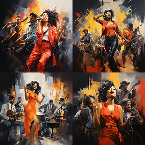
The key to any generative AI program is the prompt. The prompt and some other settings that can either be put in place beforehand or added into the language of the prompt heavily and in ways not fully known significantly impacted the images the program outputs. The real key is to be as descriptive as possible, but there is also a key to finding the balance. Sometimes, adding fewer descriptive terms adds far more exciting and preferred results. The most important thing to remember when utilizing this software is to have a point of view. To still be in control (as much as possible) of the final image outputted. Remember that some work on the backend in Adobe Photoshop or a similar program will need to happen.


The real fun began with the blending mode of the program. Blending will allow an amalgamation of up to five different images. This is an excellent feature. As the images come closer to the preferred output, combining them creates the most suitable images for the brand. Again, a great deal of the final images utilized in the branding were only possible with this feature, as the large amount of time it might have taken to manage that task through Adobe Photoshop would have been an obscene amount of time.
Another consistent part of the imagery section was street art. When developing the branding, it was essential to utilize brick texture as that was more representative of street art or the powerful murals that have increased in scale and quantity in recent years. Initially, the intended textures on the Look & Feel Board were brick and concrete, but ultimately, the concrete was cold, stark, and distracting, whereas the brick provided warmth, grit or texture, and a needed pattern. The other significant factor when envisioning those textures as a staple to the branding for this identity was simply what is hard to argue against: that hip-hop was born in the Burroughs of NYC (Ice-T, 2012).
Utilizing street art in the branding speaks directly to the culture Mandy shares with her audience. Artists use street art to highlight or pay homage to people or events of significant cultural or sociopolitical meaning. It is a powerful way to shed light on injustice and hopefully plant seeds for a brighter future (Sabino, 2020). The key to creating the street art look was solely and somewhat ironically in using layers and, more importantly, experimentation. Taking the expressive portraits created in MidJourney of Mandy, layering those with the brick, and tweaking opacities with layer styles ultimately led to powerful imagery reminiscent of art generally created on a large scale with hours, if not days, weeks or even months of strenuous work and cans of paint. The ironic part is how much those images evolved throughout this process; it took months of experimentation that led to the final approach that had a great deal of strength in its grittiness to create imagery that felt more physically real.


Another element that is consistent in the branding are the organic pieces of paint. These were some of the first pieces of genuine excitement that came in the early stages of brand development from a visual standpoint. They were so important as they not only add pops of color and fun aesthetically but also speak to the music itself and the nature of be-bop jazz with its harmonious sounds that are highly improvisational and organic, as well as the rhythmic beats and flows that hip-hop offers.
Vision Board
A drastic difference can be seen between the original and final vision boards, created four months apart. Revisions were being made due to significant changes in the brand identity throughout that time. From a top-level perspective, the document was simplified and made far more cohesive as it aged.
As previously stated, the concrete texture initially utilized in the first version of the vision board and style guide was omitted. There was also a shift from showing brick as a standalone texture. Instead, it is only shown with graphics and solid color at a transparency above it. The imagery regarding the portraits was lessened, allowing one stand-alone image to shine with more prowess. Another significant change that needs to be called out before delving into elements, such as the inclusion of the logo and how that came to be, is the simplification of the messaging itself. Throughout the brand development journey, the importance of the primary tagline and, more importantly, the treatment of that tagline became abundantly clear. Another is the onlyness statement, which morphed more into a call to action or selling point for the brand itself. The statement does a beautiful job of encapsulating the voice and tone of the brand in the archetype's voice, which, as stated in the research PLO Page, is Explorer. Lastly, the piano keys and any indication, nod, or usage of a piano, excluding verbal, have been removed from the brand almost entirely, as those images can be reserved for social media usage.


The evolution to note between the vision boards is the exodus from rigid lines and angles to objects and placement that are far more organic. The first draft was intentionally chaotic; elements were out of alignment, and much tension was built. Sharp contrast was used in color, shape, and line weight. This draft was intentionally indicative of both improvisational jazz and the music influenced by it, hip-hop, as hip-hop was bold and at odds with the world in its origin.

As the brand development progressed, more of a focus was put on the cohesion of the different elements. Furthermore, through that exploration came a look that flows far more aesthetically and authentically, expressing the brand.

Typography
The typography was a large part of that evolution, excluding a logo that did not exist on the first draft at the time of creation. In the preliminary stages of font exploration, in terms of the header, there was consideration for plenty of different font styles that would suffice. Generally, they leaned towards geometric fonts, mainly from the inspiration of jazz album covers through the ’60s and ’70s (Paulo et al.; J., 2012). With that in mind, the choice initially for the headings was Impetus Heavy. This had a duality. It was reminiscent of street art, of stencils and having a great deal of weight or bulk to it, but it also likens itself to handwritten type that could be done for a sign seen at protests with a chisel tip or magnum Sharpie. From there, it was essential to have clear subheadings and body copy, which Century Gothic Pro does wonderfully. Exploration was put into other fonts with a handwritten feel, more indicative of 90’s hip-hop, such as Subway New York STD and Permanent Marker Regular. Ultimately, legibility won out on that decision as function had to take precedence over aesthetics.
Ultimately, as the branding progressed, the initial typography choices were revised to fonts with more of a handwritten feel, as they needed to fit better with the brand's nostalgic elegance and power. The revised typography choices complemented the overall branding better. The decision was made to utilize fonts from the Tipofili foundry, which specializes in fonts influenced by hand-lettered posters from the early twentieth century (Tipofili • Portofino, n.d.). One of the most excellent features of the header font is how well it works when manipulated to flow, allowing further cohesion with the rest of the imagery. It can be seen on the final version of the Vision Board in the application of the brand’s tagline. What brought the font revision to light several months after the initial decision to utilize them was how they appeared in the logo.


Logo
The first step in preparation for the logo design was reviewing the research that led toward the look, feel, and vision boards completed in the previous course of this program and the boards themselves.
Week 1: Ideation
Following the brain dump, a mind map was completed, connecting the dots of some of the ideas that stood out from the brain dump. Lastly, smaller brain dumps were completed to do more focused sessions of thumbnail sketches.
Following the preparation phase, the ideas were incubated before diving into multiple weekly sketching sessions. Periodically, it was essential to take breaks and seek inspiration. Leafing through the book Jazz Covers (Paulo et al.; J., 2012) was beneficial as it showed a rich history of visuals and inspired further listening, which was used not only for a break but to add some creative music to the air. Another excellent background element that gave further insight into the rich history of rap music/hip-hop was a film by Ice-T: Something from Nothing: The Art of Rap: Tracing the Rise and Global Influence of Hip-Hop. Often, movies, especially if seen at least once in full, can be an excellent source to plug in and out of when working through sketches or any form of traditional art. Lastly, and intentionally not until much later in the process, hop onto social media (Pinterest, Instagram) for inspiration, but most importantly, to ensure differentiation in thinking and subsequent sketches to follow.


Many completed sketches focused on bringing in a musical instrument or elements from sheet music, such as staff and clefs. One element in particular that was used in multiple sketches as a solid iconic image relating to jazz music was a microphone of a particular shape seen above being used by Billie Holiday.
Week 2 Logo Refinements
A vinyl record is one vital element that speaks to the origins of hip-hop and the psychographics of the target audience of the branding. The records of previously recorded music and the use of turntables are where hip-hop or rap music was born in NYC (Ice-T, 2012). The city led to many design decisions, from the initial look and feel board to the sketches below. The city and the art of Graffiti grew in popularity, notoriety, and hip-hop in the last five decades (Jenkins, 2015). That is what led the designs to focus on using brick for texture and imagery and a chunkier font that speaks to tags or other words that can be seen graphically in graffiti and Jazz albums throughout the decades. (Paulo, J., & Wiedemann, J., 2012).

This sketch might be tricky to get at first, for the viewer to have their aha moment. It utilizes a treble clef, seen on Western sheet music (regardless of genre.) The clef here is upside down; this works fantastically from a differentiation standpoint and aesthetically with the tour name, but it also speaks to the tour itself and the music Mandy is performing. She is going from jazz to a genre that, although rooted deeply in jazz, still needs to be understood or listened to statistically by older people (Susic, 2023).

The microphone is an essential piece of equipment for jazz music, especially any jazz that includes signing or scatting, and certainly an essential element when thinking of hip-hop, which is significantly focused on the words and the delivery of those words (Sound Field, 2021). This particular mic has a very nostalgic and vintage feel to it, and it is iconic to the point that when used in a logo, it can be easily recognizable for what the item is. However, it also can speak to a different era in music. Lastly, the chunkiness of the mic both complements and stands up to the chosen font for the logo and brand and allows for some smoother lines in the shape and more organic, flowing lines at the base, which speaks to the theme of the brand (as called out in the vision board.)


This sketch utilizes the font to add perspective and even more weight and stance, which is a direct link to rap or hip-hop that often reflects prowess or power. The forms below the words are indicative of multiple things. The first and most important is a stylized way of showing a vinyl record, with a graphic representation of the outline and the grooves that hold the music. They also represent something being broadcast, which speaks directly to the brand itself, a tour focused on enriching the audience's life through the power of music. Lastly, they are symbolic of ripples, which speak again directly to the brand of the evolution of hip hop, which is deeply rooted (but not limited to) in Jazz (Jazz Night in America, 2017).
Seven times out of ten we listen to our music at night
Thus spawned the title of this program
The word, Maraud, means to loot
In this case, we maraud for ears
A Tribe Called Quest

This logo concept speaks directly to the brand’s need: understanding. Mandy Madison is a musician who can share her wisdom with others, a trait an owl symbolizes to most people (David, 2023). It is an animal that has always wowed, and although it can sometimes feel more mysterious and have even more profound meanings depending on when and if the animal is seen in nature, it is always a profound sensation, something deeply connected to humans. The other factor is the term “night owl.” This term is commonplace in America and speaks to musicians and people who love music. The evidence of that is still seen in larger cities across America. NYC, for example, which is often considered the birthplace of rap/hip-hop, still has late-night jazz clubs open with patrons lining the block at late hours, hoping to witness or be part of a transcendent experience.
For the reasons above, the design speaks to the brand. It could be a stretch, but it also feels like the right kind of stretch as it can give the target audience their aha moment. For the most part, this is regarding an older generation now, one that can, in some ways, look down upon the younger generations and could be seen as being snobs. Music and the knowledge of music gives one power, just like any other art form or history. There is a power in knowing, hunting, or researching for more information or feeling the insatiable craving for more music from an artist or a song that must be listened to every day, maybe multiple times a day.
Initially, as seen in the first three sketches, the owl read more as an angry mascot for a sporting team versus a wise, majestic animal often found in literary history, such as the wise owl from Winnie the Pooh. In the final two sketches, the shape started to take form, most notably taking the form of the letter m, more appropriately matching the shapes and form of the heading’s font chosen on the vision board. Allowing the “M Owl” to take center stage in the final version allows all of the other letters and words to radiate from its being; it gives the bird shape and form, and softening the look to be more graphic allows for a more approachable symbol in the heart of the design which lends itself to the brand, and what the tour is offering the target audience.
Through self-evaluation, it clarified the importance of simplicity. Attempting to have too much detail, focusing on bringing in too many elements, or boxing in a logo takes away from it, ultimately leading to more confusion for the viewer (Carson et al., 2022).

The communicated message is the connections made by the artist’s performances. It speaks directly to the brand's need: understanding and symbolism in other ways. The first is that Mandy is a crossover artist, and yes, while this might be too on the nose, a bridge helps one cross over from one place to the next. The final design took inspiration from one of the most famous bridges in hip-hop lore, the Brooklyn Bridge. The design accurately identifies the brand’s purpose or need but potentially misses telling an unknown bystander that this brand logo is for a musical tour. The logo represents a large part of the target audience, as the patrons who would see her perform live are predominantly urbanites. Bridges in most cities are landmarks that serve as functioning arteries and treasured icons.
The self-evaluation process brought back into focus the need for the theme to come through in the work. The theme dictates a need for more organic or smooth designs in the shapes and line work versus something too clean or crisp. In all reality, the rich history of what the tour offers truly needs something balanced in its approach, not overly organic or rough and raw but certainly not too clean-cut. The initial sketch was very rudimentary, as a thumbnail should be. It was important for the letters to be part of the bridge versus only existing outside the structure. Working through the sketches, pleasant shapes and line quality needed to be used to speak to the brand’s vision board. While continuing through the sketches and working through variations and revisions, it was clear that the perspective had to change mentally, and, in turn, adding perspective to the logo made a more exciting and recognizable design.
Week 3 Logo Refinements
The six concepts from the previous week offered unique strategies and different advantages, but all certainly had significant room for improvement.

Option 1 (Top Left)
This concept allowed for the importance of typesetting to shine through. It pointed out fatal flaws a designer can make, such as spacing, leading, and kerning. It is necessary to ensure that various elements have a balance, harmony in how they interact, and enough breathing room for each other to stand out individually while still speaking cohesively as one unit, one logo.
Option 2
(Middle Left)
This concept showed the importance of hierarchy in a logo. If everything, such as sizing or weights of fonts in two different words, is set at the same size, the design needs more organization to guide the viewer to what is most important.
Option 3
(Bottom Left)
Option 5
(Middle Right)
Option 4 (Top Right)
These shapes, primarily created using a French curve system, are organic and ever-present in human art and design. They come naturally and are visible in symbols across the globe, ranging back centuries, in various religions and theologies. Utilizing the shapes and integrating the type within the elements naturally creates a more organic or balanced approach.
This concept was necessary for one main reason. The treble clef was something that kept coming back throughout the ideation process. For that reason alone, it had to be explored. Throughout that exploration, some elements and approaches could be carried through into other design concepts, but most importantly, some ideas could be left behind, things that had to be moved past to get to other design solutions.

This concept shows the importance of simplicity in overall shape, individual shapes, and logo elements. Depending on the color choice, it could be a practical option for the brand to help speak to its identity.
Option 6 (Bottom Right)
The most modern approach out of the grouping. The simplified logo is effective for that reason its simplicity. The font choices prove their effectiveness in this choice, the different weights complementing each other and supplying a clear hierarchy of importance to the viewer. The shapes below the wording are practical as they can be perceived in multiple ways, one being something radiating, such as sound, another being the edge and the grooves of a song on a vinyl record. Both are abstracted from a visual perspective.
The album cover above significantly impacted concepts Four and Five. The flowing, organic shapes speak to the music and have visible elements of musical notes and musical-notation symbols, such as clefs.
Vectorization
Vectorization and the ease of creating perfect shapes, playing with text, and the shapes that come from within come versus utilizing traditional drafting materials.
The concept on the left side of the document offered a significant chance to experiment with the messaging hierarchy—working on different concepts where the artist’s name was more prominent than the tour’s name and vice versa. It also offered a chance to play with the edges and overall shape of the elements, which greatly influenced other explorations of different concepts.
Again, the concept in the top right-hand corner was further explored, ultimately leading to design decisions that significantly impacted other concepts, including the final logo. Ultimately, there was a realization that the shape alone would not work for this brand. Whether it be that the shape comes with so much of its meaning and history and attempting to distort that is not wise or possible in a meaningful way. Ultimately, any decision ended in unpleasant and unrecognizable shapes or a logo that felt disconnected and disorientating for the brand.
The bottom right-hand portion of the exploration was only possible with the weeks of exploration that came before it. The sketch drastically jumped from its initial sketch stage to the final vector in the next assignment. It came from aha moments and the collective research from the previous course, from thinking back to the need, but importantly, thinking of the target audience or persona, largely melomaniacs, and audiophiles.
Exploring and playing with the font and the individual placement of letters led to something more profound and exploratory, like jazz album covers through the ’60s and ’70s (Paulo et al.; J., 2012), allowing the words to flow, which was much of the exploration this week. Digging back into that nostalgia of a different time allowed a new concept to emerge.
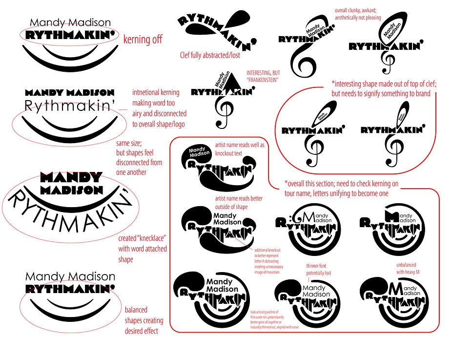
Concept 1 (Left side)
This concept is indicative of the music being performed. It speaks to the music that significantly defined the artist and the music the target audience seeks a better understanding of Jazz, Soul, and funk that eventually evolved into one of the most popular forms of music today, Rap. However, more importantly, it showcases the culture that created that music: Hip-Hop. (Ice-T. 2012). Through the exploration done, two letters indicated a form that had yet to be visible through any previous explorations: a turntable needle. That needle is vital for the development of hip-hop, and it speaks directly to the brand's target audience. The rest of the design quite literally formed around it!
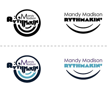
Concept 2 (Right Side)
This concept is the most modern approach to the design problem at hand. Its simplicity effectively highlights the artist’s name and tour name, which is the brand. The waves of sounds/reflections speak to the brand as well. Mandy Madison is an artist who could not pursue her passion and share that passion and wisdom without breathing through and out the knowledge of the music pioneers who came before her. Her role is to impart that wisdom to the audience that chooses to witness her live art and gain further knowledge themselves. The bottom portion of the logo also doubles in purpose, allowing once again the iconic vinyl record to come through, catching the eyes of a certain psychographic.
Final Logo
Vectorization and the ease with which you can create perfect shapes, the ease of playing with text, and the shapes that come from within come with less ease when utilizing traditional drafting materials.

Another concern was that the typography choices were essentially geometric and needed more organic branding features. The Rythmakin portion meant simply rounding out the font further to make a more organic, pleasing, and softer design. Further research via Google and Adobe landed on a font foundry that specialized in fonts inspired by hand-lettered fonts from the early twentieth century: Tipofili. One font aligned with the brand and the logo incredibly well: Portofino. This font added cohesion and ensured legibility, as Mandy Madison was becoming disconnected and confusing. There was also careful precision in revising the clef or spiral above letters t and h, which initially felt overly organic and somewhat clunky upon further examination. The last refinement helped reveal more of the iconic symbol or icon at the heart of the design: a vinyl record. Placing the counter back in the top portion of the letter A, above the crossbar, served a dual purpose of representing the play hole of a vinyl record as well.
Media Assets
There was a chunk of assets that were very necessary to focus on for this brand, such as public transportation, recognizing that a large swath of the target audience is urbanites. The second was the choice of SWAG products: T-shirts, Vinyl Records, and Collectible Action Figures or Dolls, recognizing consumer trends mentioned in the previous PLO.
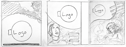
Public transportation signage was kept simple, focusing on the minimum amount of images and messaging to get the voice and tone across to the audience.


Through the brand development, the type of treatment evolved to be far more organic, allowing for more consistency within the brand, beginning with this poster. Above was the final, and to the right was the original or prototype.


The T-shirt design was prompted by designs that can be purchased for “jam bands” or psychedelic rock shirts for many decades in the US. Generally, these T-shirts utilize tye-dye as part of the design, which has a way of wrapping around or encompassing the shirt in color. This approach worked well for this design by utilizing the organic shapes of the brand and creating intrigue on both the front and back of the design.


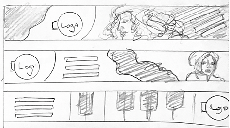
Initially, the vinyl record would include a vinyl action figure or doll in the packaging. As the sketch below shows, there would be pop-up elements so that the record jacket would work as a diorama representing a music venue in which the consumer could place their doll. Ultimately, the realization was that this was going too far; as with most collectors, the idea is to keep things intact, especially collectible toys, which instantly lose value when removed from packaging. With that in mind, the decision was made to make these two separate pieces of SWAG.
REFERENCE:
Sound Field. (2021, February 1). How Jazz and Hip Hop Harmonize: J Dilla, Herbie Hancock, and Nas [Video]. YouTube. https://www.youtube.com/watch?v=LBKeDBr2M3U
Jazz Night in America. (2017, April 19). Robert Glasper: “Jazz is the mother of hip-hop” [Video]. YouTube. https://www.youtube.com/watch?v=Caxwob1iKX4&t=1s
Prange, M. (2020, May 12). “Hip Hop and Social Movements” sandiego.edu.https://sites.sandiego.edu/blackhistoryatusd/2020/05/12/hip-hop-and-social-movements-maxwell-prange/
Sabino, P. (2020, October 15). Fred Hampton mural revamped to honor Black Panthers - and give West Side Kids a lesson on the struggle for Equality. Block Club Chicago. https://blockclubchicago.org/2020/10/14/fred-hampton-mural-revamped-on-west-side-to-honor-black-panthers-and-give-kids-a-lesson-on-the-struggle-for-equality/
Tipofili • Portofino. (n.d.). https://tipofili.com/fonts/portofino
Mashable. (2023) This is your brain on hip-hop. Mashable. https://mashable.com/ad/feature/science-of-hip-hop
Ice-T. (2012). Something from Nothing: The Art of Rap: Tracing the Rise and Global Influence of Hip-Hop. [Video]. Kanopy. https://www.kanopy.com/en/fullsail/video/954855
Jenkins, S. (2015). Fresh Dressed: The Evolution of Rap Fashion. [Video]. Kanopy. https://www.kanopy.com/en/fullsail/video/668332.
Carson, N. , Christie M. (2022, Mar 22). How to craft a powerful logo shape. CreativeBloq. https://www.creativebloq.com/logo-design/psychology-logo-shapes-8133918
David, L. (2023, July 6). Keep seeing owls? here’s the spiritual meaning (depending on its color). mindbodygreen RSS. https://www.mindbodygreen.com/articles/owl-symbolism
Paulo, J., & Wiedemann, J. (2012). Jazz covers. Taschen.
Susic, P. (2023, February 22) 48 Rap & Hip-Hop Statistics 2023: Listeners, Demographics, Industry. Headphones addict.https://headphonesaddict.com/rap-and-hip-hop-statistics/
Golsen, T. (2022, April 1) How Gil Scott-Heron did more than invent rap. Far Out. https://faroutmagazine.co.uk/gil-scott-heron-did-more-than-invent-rap/